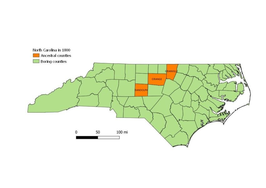
I have received several requests for instructions on how to create a map using historical county boundaries, as I feature in my publications:
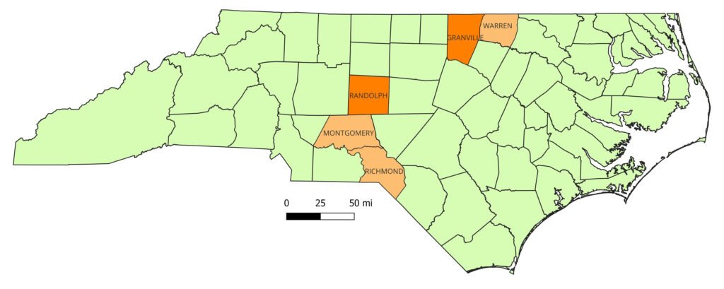
Making maps for genealogy is one of my very favorite things. It combines several of my loves—maps, genealogy, history, and GIS. And teaching is another of my favorite things. So I’m very glad to share how to do this.
1. Get the QGIS software.

You can create a map like this in many GIS (Geospatial Information Systems) software applications. But the one I use and will recommend to you is a free, open-source one that is also quite powerful, QGIS. It is available for Windows, MacOS, or Linux, so most people should be able to install it.
Go to the QGIS download page. There are several download options. If all you are planning to do is create maps, the big green button for the Long-Term Release version is probably fine. Download the software.
Once the download finishes (it’s a pretty large file, about 1.2 GB), run the installer. Accept the license agreement and the default options should be fine.
After the software is installed, we can leave it for right now.
2. Get the historical county boundaries shapefile for your state.
Next, we will go to the outstanding Atlas of Historical County Boundaries at the William M. Scholl Center for American History and Culture at the Newberry. At the AHCB, scholars have done an amazing job of compiling a history of historical county boundaries, with every permutation and change, new counties and extinct counties, for every U.S. state. If you have not seen this before, even just browsing it can be fun.
But today we are after data files, specifically shapefiles. A shapefile is a vector data format that stores georeferenced points, lines, and polygons—georeferenced meaning every feature is tied to its geospatial (i.e., geographic) coordinates. The curators of the AHCB not only have published the history of the county boundaries, but they have published the geospatial data along with it that allows us to create maps and do other cool things. So, let’s go the link on the menu bar that says “Download Files“.
From there, we go to the link that says “Download State Files“. I could have saved you these steps, and just given that link, but I wanted you to see how cool the AHCB is!
Here, you’ll see three columns of files for each state: GIS files, KMZ files, and PDF files. The GIS files are the shapefiles (shapefile is a format introduced by ArcGIS, the leading proprietary GIS software). KMZ files are zipped-up KML files—that’s Keyhole Markup Language, the format used by Google Earth and Google Maps, which would allow us to do other cool things like superimpose historical county boundaries on present-day Google Maps, which honestly would be really cool to do also.
Today, let’s find the state or states you want to make a map of and download the GIS shapefiles. For purposes of illustration, I’ll be showing you how to make one of North Carolina, but the same procedure will work for any state. So click on the link for North Carolina, and download a file called NC_AtlasHCB.zip.
Once the file is downloaded, we need to unzip it to someplace where we can get to it again. I have a directory in my “Documents” folder called “GIS”. The NC_AtlasHCB.zip file contains several directories and other files. The directory we will be working with is “NC_Historical_Counties”.
Now, we are ready to make a map!
3. Load the shapefile into QGIS.
Now, we open the QGIS software application. Once it opens, you’ll see a menu of project templates, which includes (probably nothing but) “New Empty Project”. That’s what we want to do.
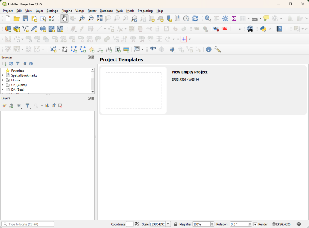
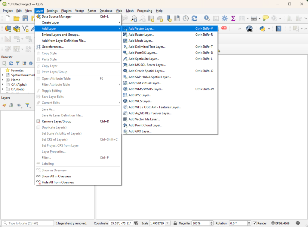
Now, the earth was without form and void. But it’s time to add some data to the blank canvas. There are several ways to add the shapefile to the map project. Probably the simplest way is to drag and drop it from your File Explorer window (or your Finder if you are a Mac user) into the QGIS canvas. You can drag the whole NC_Historical_Counties folder (several files inside the folder, like the NC_Historical_Counties.shp, will also work). Alternately, you can go the “Layer” menu in QGIS, select “Add Layer”, and then select “Add Vector Layer” (a default keyboard shortcut in Windows is Ctrl+Shift+V). That gives you a bit more control over a few things, but “more control” also means “more complicated.”
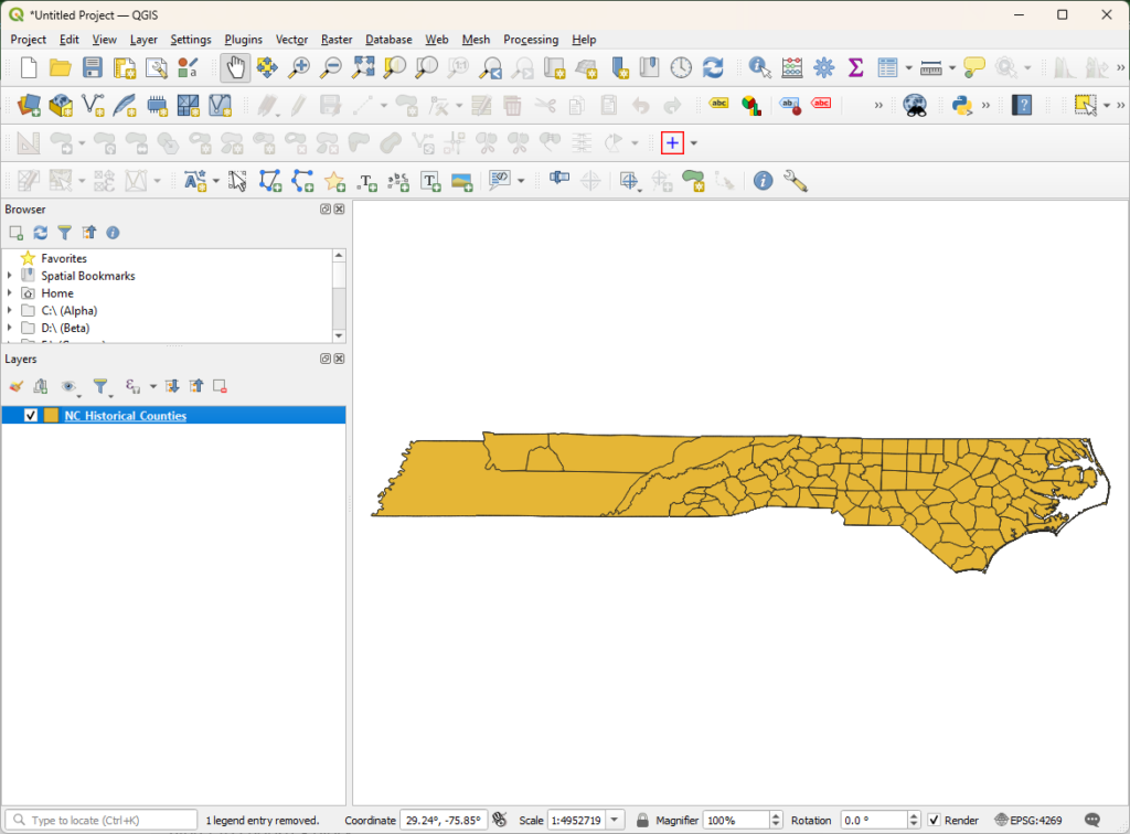
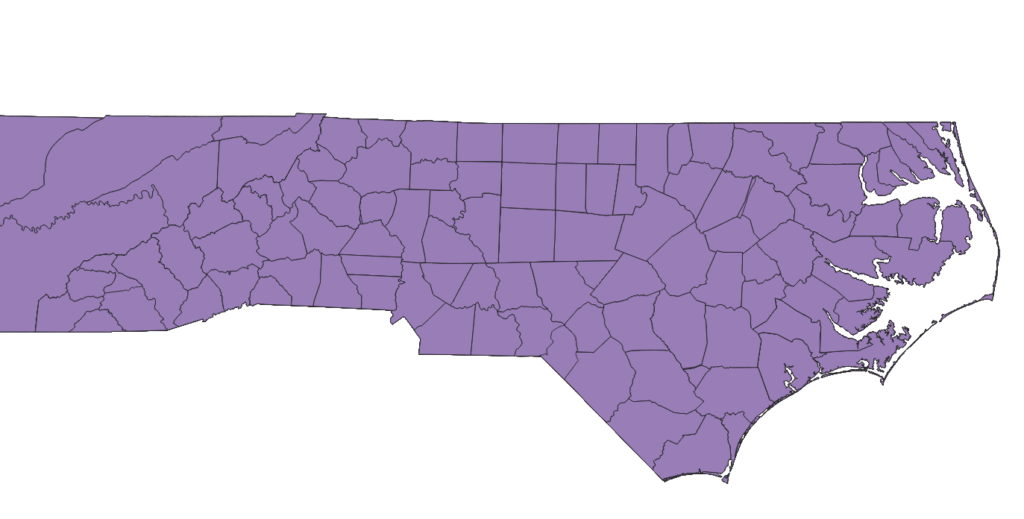
If you’ve successfully loaded the shapefile into QGIS, you should now see a whole lot of North Carolina on your map, including what is now Tennessee. Because the historical county boundaries shapefile includes all of that. The layer will now appear in the list of “Layers” at the lower left.
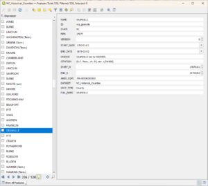
This next step is optional but informative. Right-click on your new layer, “NC_Historical_Counties”, in the layer list, and select from the menu “Open Attribute Table”. This opens a peek at what all is in the shapefile—the 528 features, multiple versions of each county with different permutations of the boundaries. If you select a county from the list, you can see the data fields that are stored in the shapefile for each feature. Looking at this now should help what we do later on make a little more sense. Notice several of the fields—NAME, of course, and also START_DATE and END_DATE. You can close this now.
4. Save your project file.
Now is probably a good opportunity to save your project file. You can use Ctrl+S in Windows or “Save” from the “Project” menu. This saves the project with the shapefile included, and as we add other things to the map, they will get saved too.
5. Change the map projection.
If you spend as much time looking at state maps as I do, you may notice that your state looks a little “pinched” or “flat”. That is because the QGIS project defaults to no map projection; what we are seeing is map data as it would appear stretched on a globe. So let’s apply a map projection.
In the lower-right corner of the screen, look for this icon and the notation EPSG:4269 (or EPSG:4326, or whatever it may be set to). This is what we are looking at now, the CRS (Coordinate Reference System) for NAD 83, the North American Datum (or WGS 84, if it’s set to EPSG:4326), which is basically a mathematical description of the sphere of the earth, which is not actually a perfect sphere but quite bumpy.
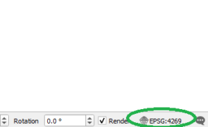
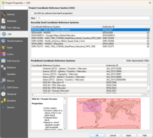
If we click on that icon, we will see a menu to choose a different CRS, including projected ones. The one we will use for this map is “EPSG:3857 – WGS 84 / Pseudo-Mercator”. You may remember the Mercator projection from school. This is the Web Mercator projection, a variant made popular by Google Maps. EPSG:3857 may appear in the top pane of the dialog window by default, but if it doesn’t, you can type “Mercator” in the filter text box and it should appear. Click “OK”.
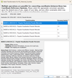
You will probably get a second dialog now asking you to select a transformation for your shapefile. If we were concerned with accuracy down to meters, we might need to think about this, but since we are making a state map, the first one is fine. Click “OK”.
Now our state should be looking a little more like we are used to seeing her on a map (except for the large parasitic growth to the west).
6. Create some symbology rules.
Now, we start making it look like the map we want. If we double-click on “NC_Historical_Counties” in our “Layers” list at the lower left, it will bring up the layer properties. At the left is a list of different properties page. What we want is “Symbology”.
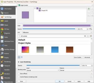
At the top of the symbology page, there is a drop-down menu that says, by default, “Single Symbol”. We want to select instead “Rule-based”.

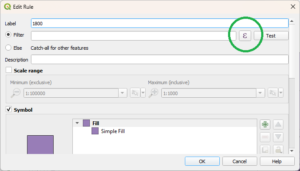
We double-click on the rule, and it brings up the “Edit Rule” dialog. The “Label” here is the name that will appear for the rule in the list. Let’s name it “1800”. And the “Filter” is an expression that will select the features we want from the shapefile. Notice that I circled the ε button. This opens the Expression Builder, which makes this next part a lot easier.
In the left pane of the Expression Builder, we type an expression, in syntax similar to SQL, telling QGIS which features to select from the shapefile. If you opened the Attribute Table earlier, then this is the part that should make more sense. We are giving selection criteria according to the attributes listed in the table. Write this expression, and click “OK”:
“START_DATE” < ‘1800-06-01’ AND “END_DATE” > ‘1800-06-01’
(Pay attention to the single-quotes and double-quotes, because they mean different things.)
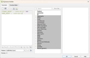
We told it to select the counties whose start date (formation date) was before 1 Jun 1800, and whose end date (abolition date) was after 1 Jun 1800. In other words, the counties that were in existence on 1 Jun 1800. Now, the expression should appear in the “Filter” box of your rule. We can click the “Test” button to see how many features this filter selects. If you are following me in North Carolina, you should get a message box that says, “Filter returned 60 features.”
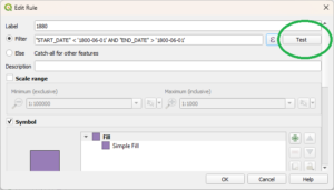
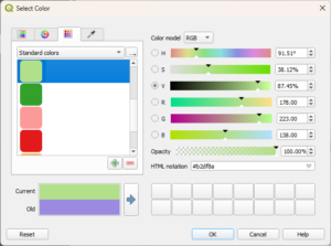
This will be our base layer for the year 1800. For the base layer, I usually select a light, unobtrusive color, as in the map at the top of this page, I used light green. Let’s use light green again. In the “Symbol” pane of “Edit Rule”, we now select how we want this rule to be represented. “Fill → Simple Fill” should already be there by default. If we click on that—either the “Fill” or the “Simple Fill”—we can select a color other than this garish purple they have given us by default. This is a color picker’s dream: they have four different color pickers. But they have a basic light green in the list of “standard colors”.
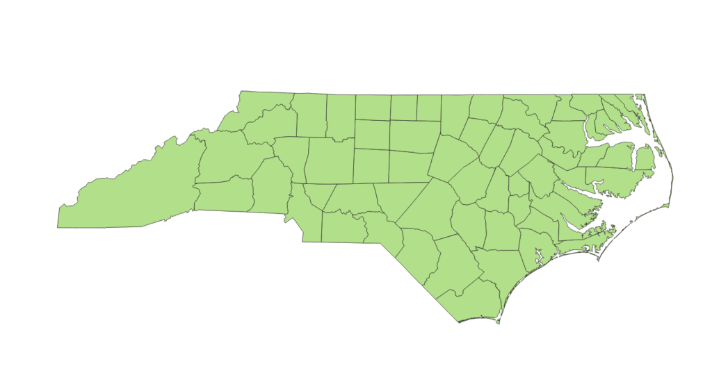
Now we have a map of North Carolina counties in 1800.
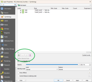
So what now? We can add some more rules. How about we want to highlight certain counties. Open the symbology panel again by double-clicking the layer. We can add rules, or remove rules, using the plus and minus icons. By selecting and right-clicking, you can also copy (Ctrl-C) and paste (Ctrl-V), which you can use to make a duplicate of your first rule. Let’s do that.
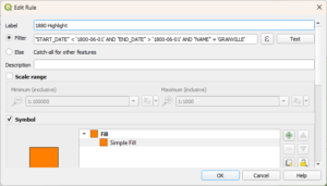
If you just made a duplicate of the “1800” rule with me, then let’s edit the second one, and keep the original date expression the same, but add:
AND “NAME” = ‘GRANVILLE’
This selects a feature, out of the ones previously selected that were in existence on 1 Jun 1800, whose name attribute is “GRANVILLE”.
Let’s set the fill color to an orange, and label it “1800 Highlight”.
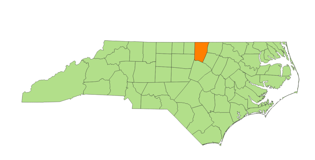
Now we have a highlighted 1800 Granville County:
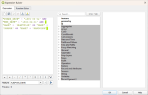
We can string as many counties together to highlight as we like into one rule. But AND “NAME” = “GRANVILLE” AND “NAME” = “ORANGE” doesn’t make any sense, since a county can’t have more than one name. What we want instead is to put the name expression in parentheses, as in a math expression, and use OR:
AND (“NAME” = ‘GRANVILLE’ OR “NAME” = ‘ORANGE’ OR “NAME” = ‘RANDOLPH’)
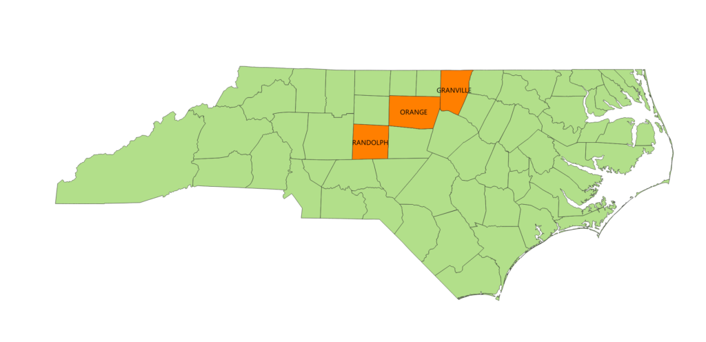
And now we have highlighted several counties:
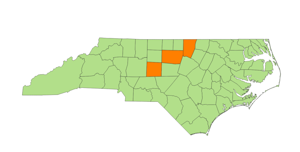
You can keep making symbology rules to your heart’s content. One important thing to remember is that the rules are evaluated in order, and you can change the order if you need to (by dragging and dropping them in the list). What I mean is, the first rule, “1800”, says to paint all the 1800 counties green. The second rule, “1800 Highlight”, says paint 1800 Granville County—which we just painted green with all the other 1800 counties—but paint it orange now. This works because “1800 Highlight” comes after “1800”. It is possible to have rules that conflict or overwrite each other. If changing the order of the rules doesn’t accomplish what you need, you can put the rules at different levels. That is getting into some advanced features, but I wanted to point it out.
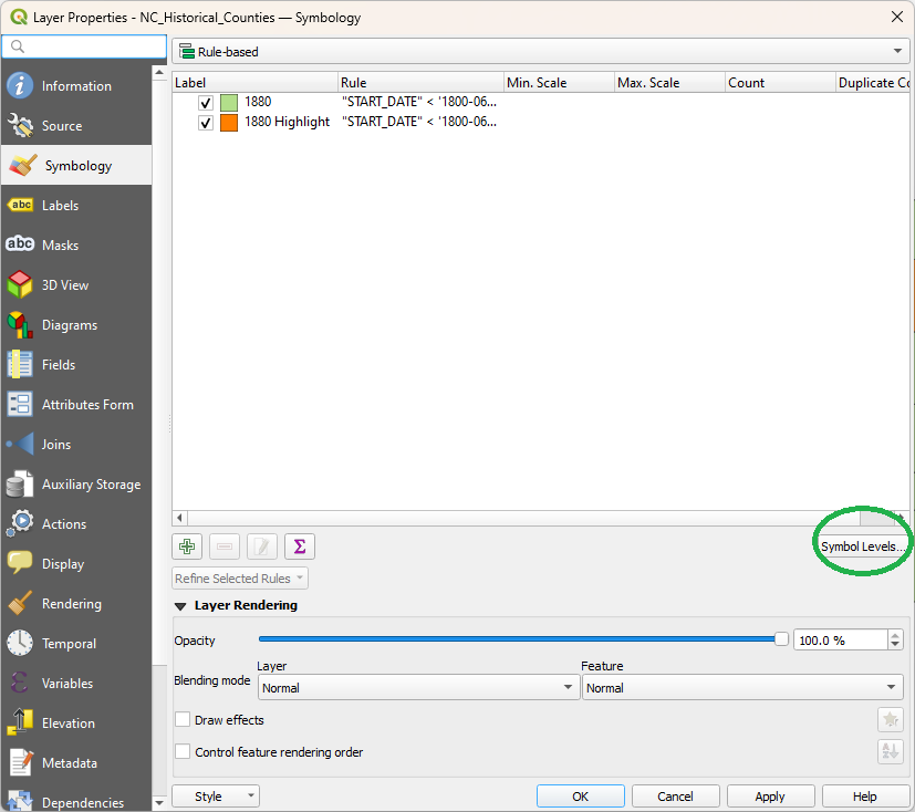
You can change other forms of representation than fill color. You can, for example, change the outline weight or color, have some counties’ boundaries appear with a heavier outline or different color or different style of line (stroke style). You can put different patterns of fill, hash marks, or gradient (fill style). All of this is in symbology properties.
Check out this map I made for my Alldredges, using QGIS and the same techniques I’m giving you here:
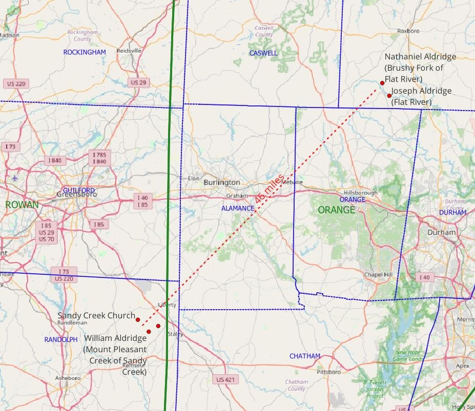
The heavy green line is the 1760 county boundary between Rowan County (west of the line) and Orange County (east of the line). The dotted blue lines are modern county boundaries. The red dots (marking the approximate location of early land grants) and dotted red line (showing distance) are also made using shapefiles.
Some other things you can do with symbology rules:
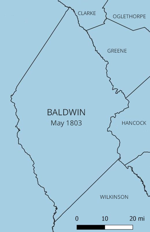
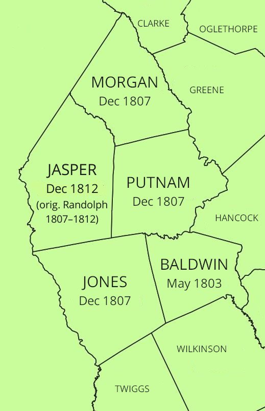
- Since the rules are toggleable on and off, with the checkboxes by the rules in symbology or by the layer on the main screen, you can create rules for several different dates in the same map, e.g. 1800, 1820, and 1850. Since exporting the map only exports what is currently visible, this is a helpful trick for ensuring that your map view remains the same when the only thing you want to change between a series of maps is the county boundaries. Like in this series for Georgia, for Baldwin County and its child counties:
7. Create some label rules.
Label rules work exactly like symbology rules, only they are for creating map labels, e.g., county names. In fact, we can use the same filters we used for symbology.
Open the layer properties again (double-click on the layer in the lower-left “Layers” pane). This time select “Labels” from the list of properties pages at the left. (You can switch between labeling and symbology with the menu at the left of layer properties without closing the window.) In the drop-down menu at the top of the “Labels” properties, pick “Rule-based labeling”.
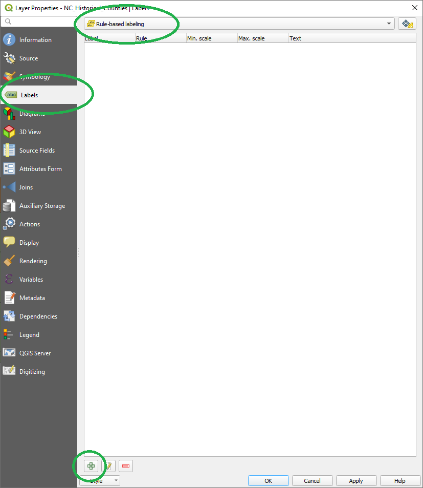
You don’t have any labeling rules to start with. You can add a new one with the “+” button. Or, we can actually copy a whole rule from symbology if we’d like (right-click on the symbology rule and “copy’, right-click on the labeling rules and “paste”), or just copy-and-paste the filter expression (open the rule and copy the text). We want a labeling rule with the same filter we used for the highlighted counties:
“START_DATE” < ‘1800-06-01’ AND “END_DATE” > ‘1800-06-01’ AND (“NAME” = ‘GRANVILLE’ OR “NAME” = ‘ORANGE’ OR “NAME” = ‘RANDOLPH’)
If you want to label all the counties, that’s easy to do, too. Just change your filter expression to leave off the NAME parameters. You can also do things like put your labels for your select counties in a different font or different color, with multiple rules; a rule for your select counties and a rule for “all the rest of 1800” counties, similar to what we did with the symbology.*
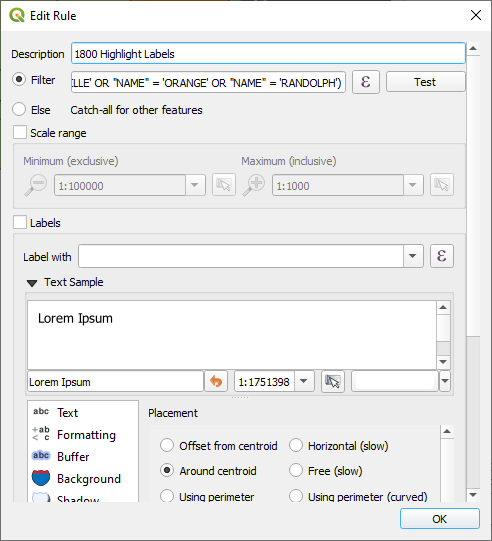
* You can see in the “Edit Rule” dialog that there is an option for “Else” rules, catching all unselected features, but “else” rules don’t really work with historical county boundaries, since “else” applies to ALL the county permutations at once. You will get labels for counties that haven’t been created yet!
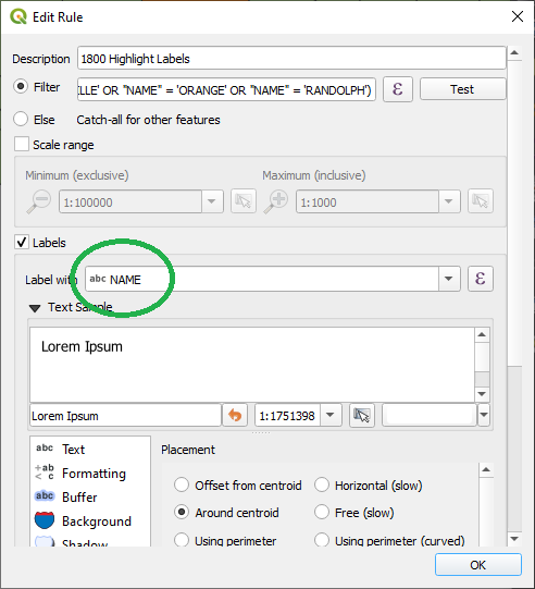
Now, notice that in the labeling rules, we don’t have options like “simple fill”. What we have is “Label with”, “Placement”, “Text”. In “Label with”, what we want to select will almost always be NAME, the name of the feature (i.e., county name). Sometimes FULL_NAME could be what you want. Note we have a link to Expression Builder (ε) here too. That means it’s possible to create labels that are more complex, stringing together several fields, for example. Let’s just select “Label with NAME” for now. “OK” all that.
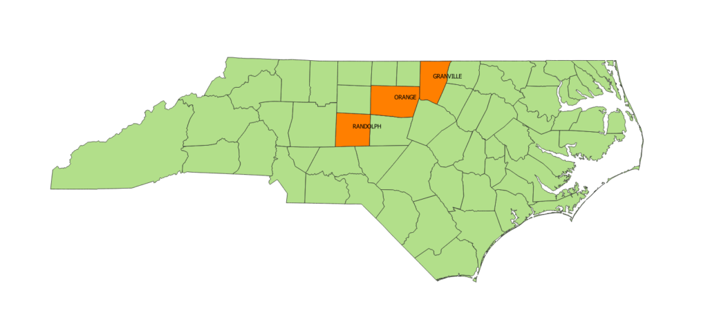
I don’t know about you, but I don’t really find that label placement all that pleasing. This is the “Placement” setting. You can experiment with different placement settings in the properties. I think “Offset from centroid” is a good setting, with the quadrant set to the center. The centroid is the calculated center of the polygon (that is, the collection of lines that make up the county boundaries).
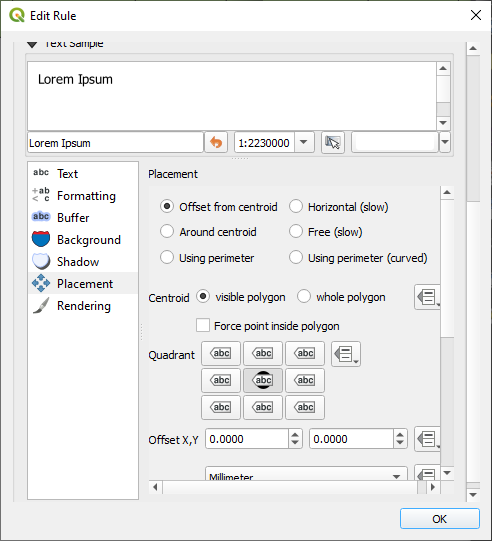
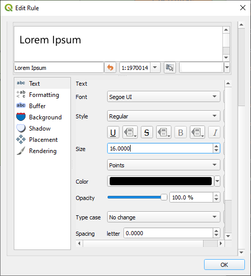
The labels are redrawn as you zoom in and out, so fit the map you will want to export into QGIS window. You can zoom in and out by a finer degree if you hold down the Ctrl key while using the mouse wheel button. If you think the labels are too small, relative to the map (and they usually are), you can increase the font size in the “Text” settings. You can also change the font. The default for Windows*, “MS Shell Dlg 2”, is an okay one. I also like “Tahoma” and “Segoe” for maps, but there are lots to choose from. I set it to 16 point “Segoe UI”.
* I do have a MacBook too, but I’m doing this current work on a Windows machine. Maybe I will update it for Mac later.
Manually reposition labels.
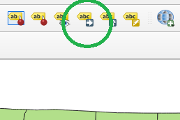
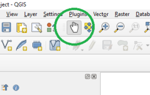
Now, there may be cases where you just don’t like where it automatically places your labels. There is a tool in the vector toolbar to manually reposition labels. Look for the button that looks like a yellow “abc” label with a blue arrow beside it. (It will ask you to “Choose Primary Key” when you select it the first time; NAME or ID is fine.) With this tool selected, you just click on the label and drag it where you want it. When you are finished moving labels, you can go back to a normal mode by selecting the tool that looks like a pointing hand (“Pan map”).
8. Create a map layout.
This part is optional. If you like how your map looks already, you can go ahead and export it from the main window; skip to the next part. But with a map layout, you can add things like a scale bar or map legend or other nifty features.
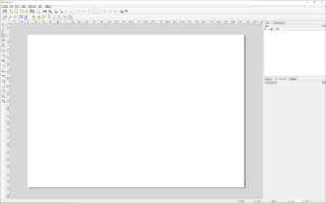
Under the “Project” window, select “New Print Layout” (Ctrl+P is a shortcut). It asks you to name your layout. Leaving this blank is fine. This opens a new layout window with a new blank canvas.
To add your map to the layout, you select the icon at the left-hand menu that looks like a map being unfurled with a green “+”.
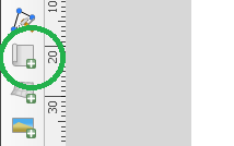
“Add map” will ask you to draw a box on the canvas that will contain the map. Fill as much of the page as you like. It doesn’t really matter, since we probably aren’t printing this layout to an actual page anyway.
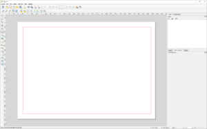
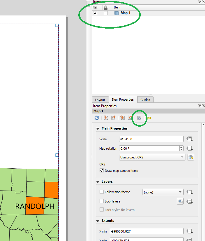
With “Map 1” selected in In the “Items” list at the top right, in the “Item Properties” pane at the lower right, there is a button that looks like cross-arrows over a map, “Interactively Edit Map Extent”. This allows you to pan and zoom the map canvas to how you want the map to be arranged for export. The similar icon on the left-hand toolbar also enables this mode. To get out of this mode, select a different tool from the left-hand tool bar, probably “pan” (the hand).
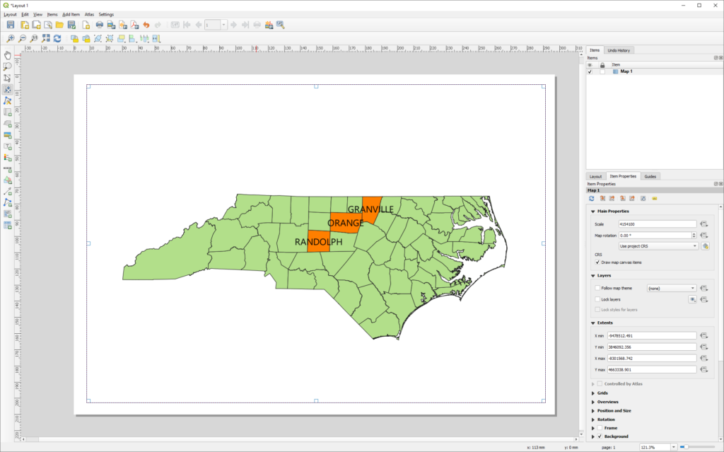
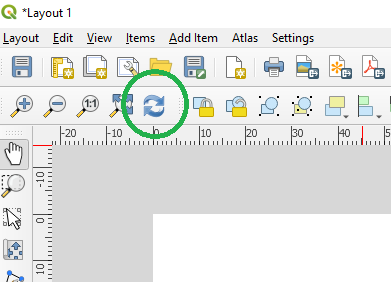
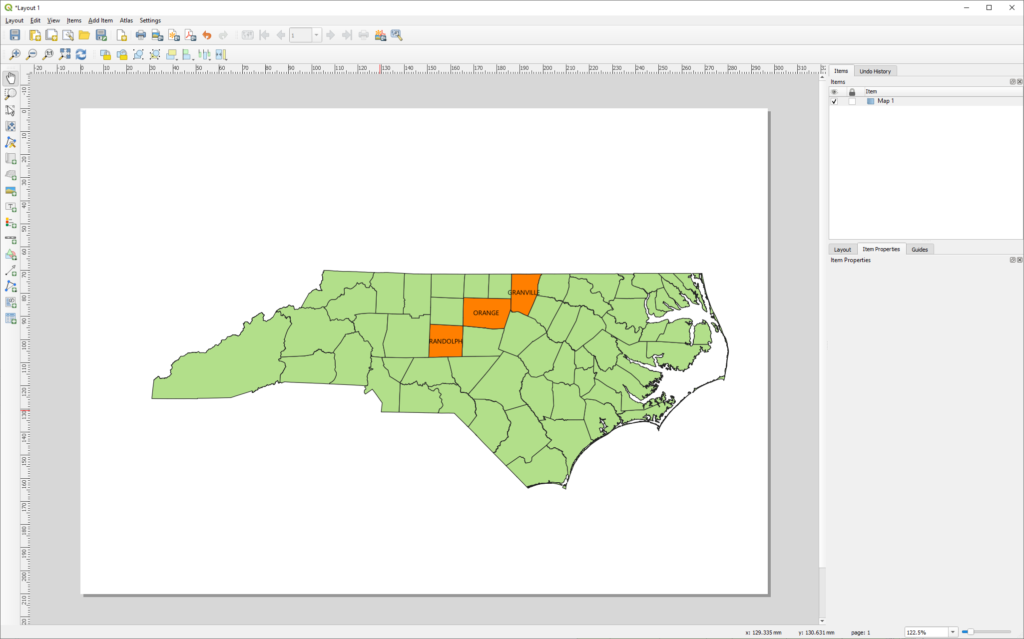
Those fonts are now looking a little bigger than we wanted, so you can go back to the main window and adjust your layer properties. I ended up taking them back down to 8 point. Maybe they weren’t too big in the first place. Once you make these adjustments, you use the “Refresh View” or “Update Map Preview” buttons (looks like a “refresh” icon).
Add a scale bar.
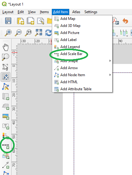
To add a scale bar, you can select “Add Scale Bar” from the “Add Item” menu, or use the tool button at the left. You then draw a box on the map canvas where the scale bar will go.
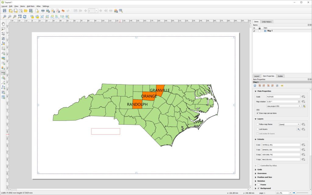
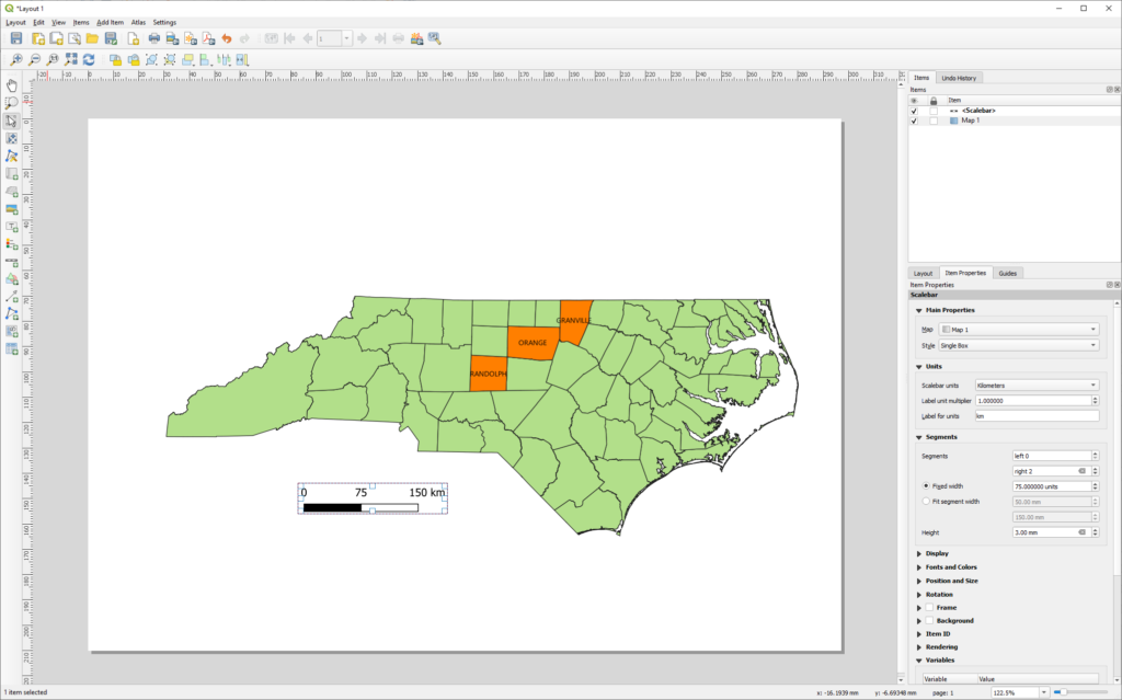
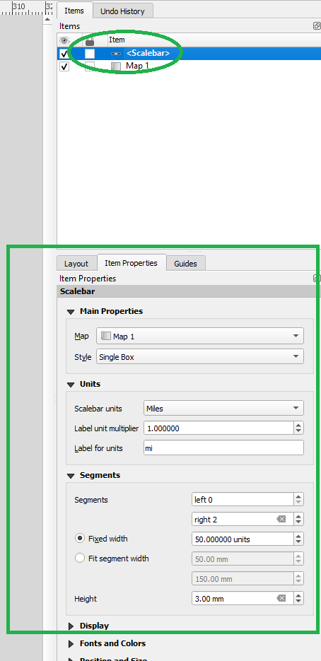
You can change the extents of the scale bar or move it around. To edit the properties of the scale bar, select it from the “Items” menu at the top right, and edit it in the “Item Properties” pane at the lower right. You can change it from kilometers to miles (or centimeters!), change the units in each segment, change the number of segments, change the font, colors, or other tweaks.
Add a map legend.
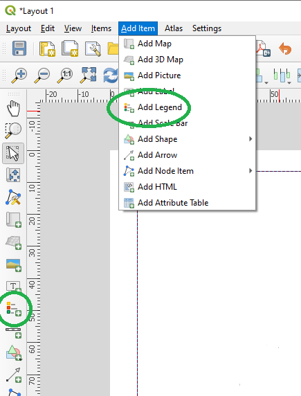
Adding a map legend is super easy. Similar to adding the scale bar, select the tool from the left-hand toolbar or from the “Add Item” menu. Same as with the scale bar, you draw a box where the legend should go.
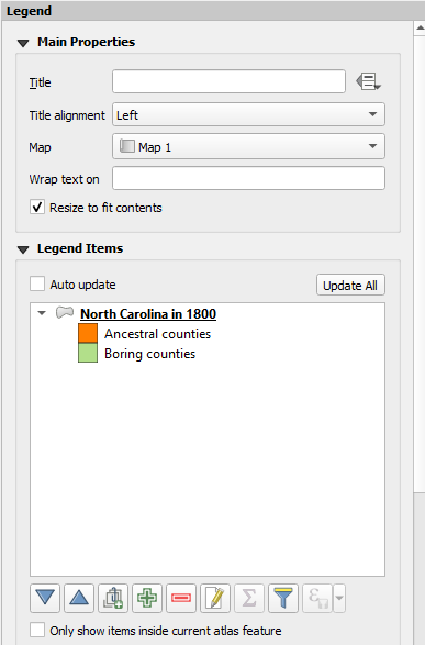
Once you’ve placed your legend, the items default to the name of your shapefile (NC_Historical_Counties) and the names you gave to your symbology rules. You can edit this list, or change the text and order of items, in the “Item Properties” pane.
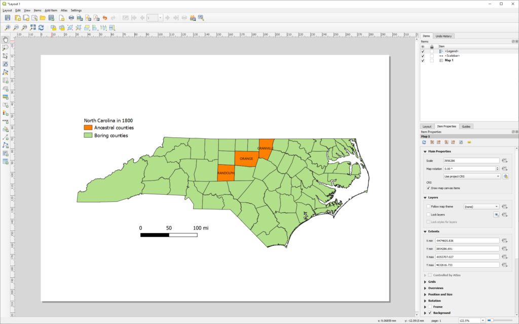
There are a lot of other things you can do, too. But I think you get the idea. QGIS is a fairly user-friendly tool, once you get over the initial learning curve. It’s also a powerful and professional tool, with some very advanced features.
9. Export the map.
You can export the map either from the layout window (if you’ve been adding layout options) or from the main window.
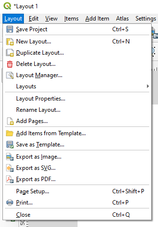
In the layout window, you can select from several options under the “Layout” menu: “Export as Image”, “Export as SVG”, or “Export as PDF”. Each of these options is pretty straightforward, bringing up a file dialog, which will save your whole print layout to the specified file. “Export as Image” supports many useful formats, including JPEG, PNG, and TIFF. “Export as SVG” (Scalable Vector Graphics) issues a complaint about the shortcomings of its underlying Qt SVG library, but I’ve never had a problem with it. This is a desirable option, since it allows you to resize the output without affecting resolution. Each export option will give you an additional dialog for export options, to which you can mostly just say “OK”. Image resolution, of course, affects both viewability and file size. 300 dpi is a good default.
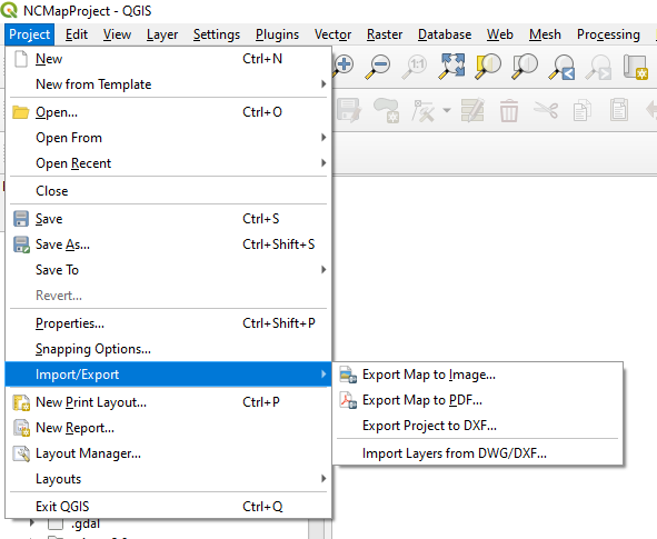
From the main window, you can go to “Import/Export” under the “Project” menu for several options: “Export Map to Image” or “Export Map to PDF”.
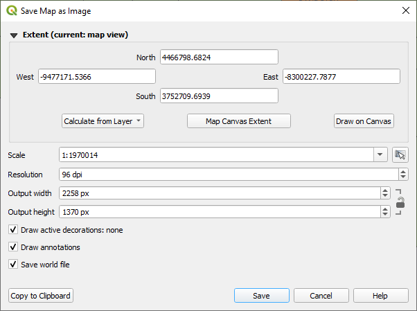
The export options from the main window will ask you to select your map extent. “Map Canvas Extent” selects the whole canvas, what is currently on the screen. “Calculate from Layer” gives you the option to select the extents of your shapefile or any other layer you have loaded. “Draw on Canvas” lets you draw a box around what you want to export.
You’ve made a map!

Congratulations! You have created a map—not just copied and pasted something from the Internet, but actually assembled a professional-quality map from original GIS elements, using a professional GIS application, and exported it. You should feel proud!
Here are a few other thoughts and tips:
- There is a lot of online documentation available for QGIS ([1], [2]).
- I often am too picky (or perhaps too impatient) to leave rendering the map entirely to QGIS. Often I’ll export the map early and do some finishing up in an image editor—GIMP is my editor of choice, since it is also free and open-source and powerful. For example, for the maps above of Georgia’s Baldwin County and child counties, I exported the county boundaries from QGIS, then added the labels (with different size fonts for the county name and origin date) with GIMP’s text tool.
- Another thing you may very likely want to do is add points or lines to your map, for example, the locations of ancestral homes, paths of migration, or the like. You can import lists of GPS points, saved as CSV (Comma-separated Values) files with feature names using “Layer → Add Layer → Add Delimited Text Layer”, or you can create your own shapefile using the vector toolbar (“New Shapefile Layer”). If you’d like, I can make another tutorial on using shapefiles for genealogy!



Thank for this incredible gift, Joseph! I just spent about an hour this morning following your clear tutorial, and I am thrilled at the possibilities. I knew there were tools like this available, but they are usually locked behind an impenetrable help guide. with your help, I was able to make small changes to achieve maps that meet my needs. They are still very simple, but they are mine! Have you thought about adapting this for a presentation on Legacy Family Tree Webinars? The rest of your site is fantastic, and has given me both inspiration and a standard to shoot for. Thanks again, and have a Happy Thanksgiving.
Thank you so much. I’m so glad you found it helpful. Happy Thanksgiving.